Monday, 1 June 2020

Drawing vs Painting

There was a discussion online recently about drawing and painting, it began with someone who loves to paint saying how she doesn't like drawing. A discussion ensued  with some strongly agreeing and some, including me, saying I find drawing relatively easy and pleasurable but painting harder. I found it interesting to know that some people like art but find drawing a chore.

Anyway looking at some of the things people said/asked about when we had a project where people were to wrote down things they found difficult , someone wrote: I'm fairly happy with drawing but often feel I go on to spoil it when I apply colour.

I have to say I often used to find this myself, I would make a drawing I was pleased with then try and turn it into a painting and find myself getting quickly stuck and disappointed. I realised that there can be quite a gulf between drawing and painting.

Anyway I thought I would look at that this week, starting with the obvious: you don't have to paint to be an artist, if some people can devote themselves exclusively to oil painting then there is no reason why some cannot devote themselves to drawing, even exclusively to pencil drawing. I always think pencil and paper is one of the simplest and cheapest ways of having a good time. So if you find painting a chore, keep drawing.

And of course you can have quite a range with drawing: pencil, (pencils-there are in fact a range of different kinds of pencil to try hard soft graphite, carbon, warersoluble pencils)  But for drawing a good choice for a bit of a challenge is pen (or pens, for again, there are lots of different kinds of pen from the humble biro-do check out online what some people do with biros; you will be amazed! italic pens, markers of various kinds, proper drawing pens, waterproof pens, water soluble pens bingo markers white pens silver pens etc ) and if you want colour, coloured pencils, do get good quality cheap children's coloured pencils are not much good. Charcoal pastel.

There are different kinds of paper to draw on too and it does make a difference, smooth paper, paper with a bit of 'tooth' as they say- slight texture, thick paper thin paper, very smooth card like paper , good for fine work and pen, rough paper good for charcoal or soft pencil, watercolour papers, coloured papers and card,pastel papers, cardboard, all kinds of surfaces. There is no reason why drawing should be boring.

Here is a nice drawing by Paul Snape, i
n a modern cubist style, an etching in fact but you could do this with pen.


And an old pencil drawing of mine of a bit of torn paper.


Monday, 25 May 2020

Continuing with the idea that art doesn't have to be realistic, we have looked at how Cubism leaves traditional perspective, abstraction influences some artist to produce semi abstract landscapes, now I want to look at NAIVE ART.
Naïve sounds like an insult but in art it covers a wide range of art in which either deliberately or innocently artists draw and paint without worrying about the academic standards of proportion, perspective realistic shading etc. The produce art in a similar way as children, they just draw what seems right.

A famous artist was  Alfred Wallis a retired Cornish fisherman
quote from Wikipedia: 

His paintings are an excellent example of naïve art; perspective is ignored and an object's scale is often based on its relative importance in the scene, giving many of his paintings a map-like quality. Wallis painted seascapes from memory, in large part because the world of sail he knew was being replaced by steamships. As he put it, his subjects were "what use To Bee out of my memory what we may never see again..."[2] Having little money, Wallis improvised with materials, mostly painting on cardboard ripped from packing boxes and using a limited palette of paint bought from ships' chandlers. 

Two Boats Moving Past a Big House.


He was championed by some of the artists of his day and became well known. 
 The interesting thing is when someone in class says of a drawing or painting 'it's all wrong' often it looks a bit like this kind of art. So is it all wrong? 

It can look either clumsy and amateurish or it can look charming and unsophisticated in a pleasing way. 


An artist who chose to draw and paint in a sort of naïve manner despite having been well trained in 'proper drawing' was Lowry, now you can tell that he had a good knowledge of 'proper drawing and of proportion and perspective, so maybe Naïve isn't entirely appropriate. The Level Crossing. 

The style is used a lot, you often see it in galleries, makes good cards so will often see it featured on greeting cards because it is a kind of 'happy style' Local artist Joanne Wishart has a sort of sophisticated naïve style, which sounds contradictory, or one of those oxymorons! but you will find the style goes from very simple 'my 4 yr old could do better' to a more developed style which still has the feeling of freedom from academic realism. Joanne has a shop in Cullercoats, do visit when lockdown is over, but you can see her work online, really jolly and very accomplished. 
LOOK UP NAIVE ART AND YOU WILL FIND MILLIONS OF IMAGES, IT IS WORLD WIDE POPULAR. Linked to other movements such as Folk Art and Outsider Art
here is an example. 


 https://www.etsy.com/uk/shop/spiralforeststudio?ref=simple-shop-header-name&listing_id=263722455

Well that's enough for now. do have a look, it looks easy but you will find the grown up in you resists your attempts to draw like a child! 

As ever doing a number of sketches, preferably form memory or else keeping the photo if you are suing it, at some distance trying to get the feeling of the scene rather than painstakingly copying. 


Monday, 18 May 2020


                NON REALISTIC REPRESENTATION

REMEMBER WE OUGHTN’T COPY OTHER PEOPLE’S ART BUT WE CAN BE INSPIRED BY THEIR STYLE. My photos of course, are for you to use.

SEMI ABSTRACT LANDSCAPE


I know, it all seems a mouthful! Artists and their wordiness!

Anyway looking at ways of drawing and painting which are of recognisable things and places but are not trying to be photographically realistic.

Last week we looked at Impressionism which is very influential and presents a simpler, colourful, and freer way of painting.


Here is a painting by Arthur K Maderson a modern Impressionist, shapes almost dissolve into shimmering colour.
But today I am thinking about the influence of Abstract Art on landscape. I think it has had a huge influence.
ABSTRACT, people can be a bit loose with their definitions, and use abstract to describe any art which doesn’t look realistic, I am a bit fussy about limiting the word to art which is non representational, againa mouthful but art which doesn’t have a recognisable subject it isn’t a tree or a person or a scene. Essentially it is shapes on canvas or paper.
Possibly the most famous abstract artist id Piet Mondrian who eventually painted nothing but coloured rectangles. And only used red yellow and blue, black and white. He thought art had reached its purest form in this kind of painting. A bit austere! A bit limiting? Another artist who became very famous and whose paintings are reckoned to be the very apogee of art (that’s a good word. Look it up) was Mark Rothko, some people practically faint over his amazing paintings which if you were unsympathetic might be mistaken for designs for a fireside rug. A very expensive one.  Yellow and Orange Mark Rothko.

Another famous one is Jackson Pollock people really like to make fun of his work but it was and is very influential, lots of artists these days like to include drips and runs in their work, maybe representing themselves as free spirits or maybe simply the enjoyment of the fluidity of paint itself. I quite like a nice splash or run of paint myself. ‘Humouring the Goddess’ Jackson Pollock.
Anyway onto our idea, that is that a lot of artists like a bit of abstraction, maybe the colourfulness, the simplification or the energetic use of paint, but they want a subject, they feel they still want it to be of something and landscape seems to especially attract semi abstraction.
Here is a painter I like, Paul Klee, (pronounced, I think: ‘Clay’) you can see the abstraction but you can also make out buildings and trees
And here is a contemporary artist using a similar combination of abstraction and landscape,  bit annoyed at myself for not noting full name, just got Elizabeth NL
I LIKE THE PAINTINGS OF Richard Diebenkorn, you can see it is landscape but his interest is very much in the shapes tones and colours, as well as a sense of the place he is painting.
 When I saw this scene at a local beach, I almost saw it through the eyes of Diebenkorn


I feel I am rambling! It is a big subject, just search abstract landscape and you will find countless modern artists doing it.

A very popular kind is the be almost entirely abstract but the establish a horizon, which gives you a sense of sky and land or sky and sea. Allowing you to be fairly free with applying paint, but retaining some sense of a land or sea scape.

Putting a bit of making tape to retain that line either at the start of after an initial bit of painting will help you feel you can paint freely but keep that horizon.

Here is an example, by Peter Wileman. You do a lot of this kind of painting. 


ANYWAY THAT IS ENOUGH FOR NOW I WILL TRY AND HAVE A GO MYSELF TODAY, AND POUT ON SOME PHOTOS WHICH MAY BE SUITABLE FOR SEMI ABSTRACTION. KEEP IT FUN, ENJOY, SHARE THE RESULTS.

Here are a few photos which may be useful to try semi abstraction, remember this means not trying to reproduce the exact likeness, but to simplify and select coloured shapes which can make up a painting or drawing.  It can be quite difficult to let go of that sense that we must get it ‘right’ A few small sketches first will help.

Monday, 11 May 2020

Non Realistic Representation Impressionism.


LANDSCAPE  CONTINUING LOOKING AT NON REALISTIC REPRESENTATION, still something of a mouthful, Lots of artists do landscape in a way which is not photographically realistic.

 I will look at two art styles which influence landscape painting, Impressionism and Abstraction.( I will do Abstraction as a separate post)


Impressionism is still super popular and influential, it is a simpler colourful way of painting. In a way it is realistic in that we really don’t stand for many hours studying a scene we look, get an impression appreciate it, and move on.

There is a famous painting by a Pre- Raphaelite painter in which he is reckoned to have spend many hours carefully depicting a real river bank in such detail every plant could be identified, an Impressionist would depict it much more simply as a mass of coloured shapes which give the impression of that view. 


So simplification, much less worry about perspective and other technical elements, make it a very painter friendly style.


A second interest was in the idea that what we see isn’t so much the objects but the light as it reflects off objects, and since light is coloured Impressionists tend to avoid blacks and greys and give everything colour, and not only colour, but colours, so a blue sky will often be several blues, a green field will have numerous different greens, plus other colours added yellows blues purples and even little bits of reds, creating a kind of shimmer. 


Pick a simple subject and instead of blending your paint build the painting up with lots of brushstrokes with subtly different colours to make each area. Acrylic is ideal but you can do it with watercolour , pastel is also ideal. The original Impressionists usually used oils.


Here is a simple effort of mine and the photo I used. Along wiht  money painting Red Boats at Argenteuil, and some photos whihc may be suitable for the style. 


Monday, 4 May 2020

1. Non Realistic Representation!
bit of a mouthful but all I mean is that there are ways of drawing and painting where you can recognise the subject, objects people landscape etc, but it is not done in a photographically realistic way. Mimetic is the fancy art word for when artists try and mimic what they see.
For the last 100 years and more artists have found different ways .to depict their subject.
One of the big experiments in a new way of representing things was CUBISM
I am severely simplify,so please do your own reading if you want, but for us I will simplify it to two main ideas
1. the picture is flat, old artists tried and were actually very good at making their art look 3D
Modern artists began to question this, shouldn't we stop pretending a painting or drawing is flat, and make our art fit that flatness?
Secondly Cubism acknowledges that when we look at something or someone we usually look at it from different viewpoints to get a better look, Cubism often tried to fit 2 or more viewpoints in the same picture. The results could look a bit odd or very broken up in to lots of fragments.
I AM NOT SURE WHERE THE PICTURES WILL END UP, PERHAPS I WILL POST SOME SEPARATELY SO AS NOT TO CONFUSE, HERE ARE THREE EXAMPLES ONE A TRADITIONAL STILL LIFE, REALISM, THE OTHER SIMILAR SUBJECT BY GEORGES BRAQUE CUBIST, THEN ANOTHER MORE COMPLEX STILL LIFE WHERE THE PICTURE IS FRAGMENTED ALMOST LIKE A BROKEN MIRROR.
Cubists sometimes added collage in fact I think they were credited with its invention.
I think the Cubists Picasso and Braque invented it, were playing; playing seriously, but still playing with new ideas.

2.
Still life seems a good subject to start with if you want to try Cubism.
There are a few ways of doing it, but first look at a fair bit of proper Cubism to get the feel if the look so to speak.
Set up a still life and sketch it but every now and then change position and try and incorporate 2 or 3 views in one. Not easy!
You could make it slightly easier by photographing it from 2 or 3 viewpoints printing them off and using them.
You may actually find it easier after a few sketches just to invent a picture from the memory of the subject .
IF YOU WANT TO TRY THE MORE COMPLEX FORM OF CUBISM YOU COULD PRINT SEVERAL PICTURES CUT THEM UP AND ASSEMBLE THEM IN A FRAGMENTED WAY, AND DRAW/PAINT FROM THAT. SEE MY EXAMPLE.
I will also ad some modern artists whose work is at least a bit Cubist. so
4 of mine including the cut up photos, one by Mark Leach, a pastel, the second by Sue Fitzgerald.


keep it light, obviously we are doing art leisurely, so this is just a chance for a taste of other kinds or styles of art.

Have fun!


Monday, 27 April 2020


COLOUR: MUD
One of the things painters often worry about  is getting muddy colours, dirty colours.
You will read about this danger in books and magazines: DANGER!! MUDDY COLOURS!!
The first thing to say is that this is partly a matter of opinion and taste;
Some artists like clean, fresh, vibrant colours, others like more earthy characterful colours.
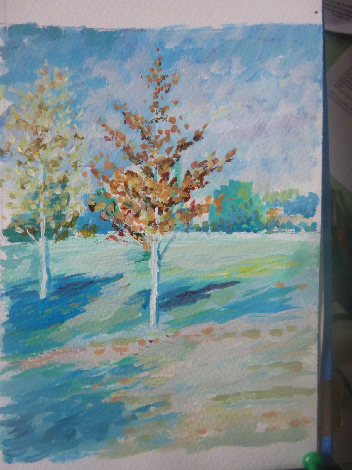
                                                                                       Aubrey Philips top Hazel Soan lower.


So be careful not to be unduly influenced by what others say, look at different artists and get a sense of what you like.
NEVERTHELESS; there is truth in the warning, it is possibly to arrive at a stage when your painting has lost its sparkle, its liveliness. it is overworked and the colours look dull. This is more a problem in watercolour than other mediums for a number of reasons and it is easier to fix in opaque mEdiums like acrylic or oil paint. But you can still get dirty looking colours in any medium.
there are three main issues:
1. the colours you use, and especially the colours you mix.
2. the way you apply the paint
3. the number of colours you layer.

1. COLOUR
Some colours are prone to muddiness, the more dense colours, some browns all the cadmiums, yellow ochre in particular, ultramarine blue, sap green, and of course black. Light red is a very dense colour.These are not 'wrong' or 'bad'  colours, there are no colours you can't successfully use,  but there are  colours you need to be careful with

Some artists choose colours which are particularly transparent; permanent rose, lemon yellow, phthalo blue, viridian.   For some this is way too bright, (but they can of course  be subdued by careful mixing)
I usually say: learn to use whatever colours you have, but be aware of the colours which cause you problems. There is no bad colour, but if you identify the colours and especially their mixtures which cause you problems you can work on improving either by substituting other colours or using those problem colours in a better way.


MIXING
Some colours are fine on their own but when mixed cause problems, ultramarine is a good blue but it can react with other colours to make effects which you may like or not like, with brown in particular it can go grainy,  (granulate to use the term people seem to like), this can be a good effect for a moody sky, or it can lead to a dirty looking colour. Sap green is to me a nice green but mixed with too many other colours it can go dull. There is a point mixing two or three transparent colours is usually no problem mixing together two or three of the more opaque colours can be a problem, ( but not necessarily, try it and see for yourself)
Some colours are simple and some are more complex, so lemon yellow is a simple colour, it is really one colour, yellow ochre is a complex colour, it is yellow but it brownish yellow, so it has bit of red and blue in as well. kind of hidden colours, so when you mix a complex colour with other colours you are mixing more colours than you may think.  Mix two complex colours and you have more likelihood of getting a dirty looking mix. 


 SOME ARTISTS WILL SUBSTITUTE A CLEANER BUT SIMILAR COLOUR, SO RAW SIENNA IS SIMILAR TO YELLOW OCHRE BUT IT IS MORE TRANSPARENT, lemon yellow with a touch if permanent rose may give a more transparent substitute for cadmium yellow. If you have trouble with brown, I find Burnt Sienna to be a cleaner mixing brown than Burnt Umber, but some artists would avoid brown altogether and mix it from transparent colours. (But as ever, you will find good painters using browns very successfully).
YELLOW: this may seem surprising but , especially in watercolour, yellow on top of other colours can produce a dull effect. It  best not used as a glaze over other colours to try and brighten,  put yellow on first, then other colours . Of course this isn't a law, try it and see. 


2. The way you apply the paint, if you watch a video of an artist,especially a watercolourist, you may note that they often have a light touch, their brush sort of dances across the paper, they don't scrub in the paint, they don't keep dabbing it and messing with it, they put it on fluidly and leave it to dry before applying the next layer. Colours are not in themselves muddy it is how we mess them around keeping touching them, especially when they are beginning to dry. Try and paint fluidly and don't keep dabbing and prodding the paint.

3. LAYERS,this is particularly important for watercolour, in fact muddy colours in other mediums can readily be fixed by a cleaner layer of paint being added once the dull layer is dry (some artists even paint a dull underpainting so their brighter colours can sit on top, giving the painting more depth). Watercolour being essentially a transparent medium this is not so easy.
I think in a successful watercolour some areas may have only one layer (some artists always leave at least a little white paper untouched), some areas with two layers; fewer areas with 3 layers, and only a small amount 4 or more. The more layers the more likely you get a dull clogged up. 

NOW THIS IS IMPORTANT: A VERY EXPERIENCED WATERCOLOURIST WILL FIND WAYS OF CONTROLLING THIS AND BE ABLE TO BUILD UP MANY LAYERS WITHOUT TROUBLE, SO THIS ISN'T AN ABSOLUTE RULE. The great thing about art is you can't do much harm whatever you do, so feel free to experiment with how many layers you can build up, the best way to learn is to do it, and reflect on the results.

Try a few versions of a picture. 
1. using colours which may produce muddy effect: ultramarine burnt umber yellow ochre, cadmium yellow.
2. Now try it with phthalo blue or cobalt blue if you haven't got phthalo (remember this blue has at least 3 names: Intense Blue, Winsor Blue, all the same colour), burnt sienna and raw sienna, and lemon yellow.
3 Build up a dark painting using  earthly colour such as burnt umber plus a little ultramarine in one strong wash
Now try to get that dark in 3 or 4 layers to  contrast the effects. You may like the more layered one, there isn't really a right or wrong but learn to recognise the kind of colour effects which you like, identify what you want to improve.  

I PAINTED A MUDDY PAINTING, WHAT CAN I DO?
1. You can wash off some of the paint, best be bold really and run the whole painting under a tap, but if there is only one area of an otherwise nice painting you may want to just carefully wet that area with clean water, and dab, don't scrub, the area with kitchen roll. The surface colour will come off leaving a softer stain. let it dry and re paint.

2. Some artists reckon if an area has gone dull you can glaze it with a clean bright transparent colour. I am not sure about  this but give it a try. 

APPENDIX 1. MY EFFORT AT CREATING MUDDINESS.


Here are a pair of pairs! something I have always found difficult is painting 'wrong' on purpose, (I get it wrong readily when I am trying to paint right)  here I have tried to do the scenes on the left with fewer layers and lighter brushwork, the ones on the right I have tried to overwork. As I said at the beginning it is at least partly a matter of personal taste and opinion whether one pair is better.

Monday, 20 April 2020


COLOUR TRIADS
TRIADS, not the far eastern mafia but three colours.
When you have lots of colours it can get confusing , some artists like to see what they can do with three colours (plus black and white if needed, (not always needed, you can usually mix a black wiht your triad choices, and  white is not needed  in watercolour)
a basic triad would be Ultramarine, lemon yellow and alizarin crimson .
Try it on a simple picture this, or one of your own.


You could change it by just changing one colour, replace ultramarine with prussian blue or Phthalo blue, replace the red or the yellow.

Other triads
a very bright one: phthalo blue, lemon yellow, permanent rose
a deep earthy one: Prussian blue, crimson and yellow ochre.
A dark one:  Paynes grey, crimson, burnt sienna.
You can combine any 3,
An unusual one: Black, cadmium red, cadmium yellow

Experiment and enjoy your colours, if you get a result you especially like repeat! or you will not learn. Repeat repeat!


Friday, 17 April 2020

DRAW A TREE
A single tree will have many hundreds of leaves, in a glance you see them all, well all that are facing you. It can be confusing: how do I draw that thing which is one and many at the same time?

As well as looking, you need some kind of pattern to help you. I often think to draw you need to organise what you see in your head, sort of take it apart and re-assemble it.
You see detail, it is what our eyes are good at, but to draw something complex or manifold, if that's the word, you need to simplify it into stages.
1. Start with the idea of a tree, a bit like a lollipop. The direction of the light usually coming from above, will determine the shadow/shading.


2. A real tree will of course have more shape, a leafy shape.
It is worth getting familiar with a sort of made up template for a tree. then applying what you understand to a real tree.

3. When looking at a real tree it may be helpful to imagine it wrapped in cellophane see the simplified overall shape.

4. Then note that it is divided into a number of smaller shapes, a bit like a man carrying lots of  cloud shaped balloons. Each shape is a bunch of leaves on the network of twigs on a single branch, but these smaller shapes add up to a single tree shape. 

5. These shapes have a light side, usually the top and a shady underside, and they will often overlap, the light top of one bit meeting the shade of the bit behind and above. 
6. You may want to add a suggestion of leafy-ness to your marks.


 Now some artists like leafy looking trees,others like to simplify  into blocks of light and shade, do look at different artists, this helps you see that there is a style for you, remember you don't have to draw every leaf- you are not a human photocopier or camera; we have machines for that, you can work in a way that suits your skill level and artistic preferences.  Or if you are like me, sometimes you are a bit lazy and want to do things simply other times you want the challenge of looking harder and focusing with all your powers.

 Here are two  efforts of mine the first is more textured with a suggestion of leaves, but not losing the structure, the second I have  focused on the structure described in shape, light and shade.


Tuesday, 14 April 2020

we have used this photo for years as a drawing exercise , yes it is meant to be upside down if you do print it off keep it upside down, the point is to hinder you thinking about what it is and focusing on what the shapes and proportions are. The theory being that when you think, it is several ladies you stop looking at the shapes lines proportions and think of the subject. Do it same size start at one corner one shape at a time assessing the line and shape, its size angle etc. then the next shape then the next. It can be done with varying degrees of accuracy and concentration so if you want to be very strict, then go for it concentrate as fully as you can, but you will find you can be a little less rigid and still get good results, enjoy each shape see it as a full and goodly shape and give each shape it's due. You can turn it round at the end. And as with all exercise repetition is good, you can use a different picture of course one with good strong shapes

Monday, 13 April 2020

Gave it a go, Using acrylics means blending has to be done fairly quickly. I did find the video helpful starting with the highlight and blending around with darker colour.


Still thinking about colour, I did think for those who have done a lot of colour mixing and who may want more of a challenge looking at how to paint metallic objects may be interesting, I gave it a go this morning, trying to paint a gold ring and it was a disaster! so back to the drawing (painting ) board for me! meanwhile found this, there are lots of very generous people online sharing how to draw and paint do use them for when your teacher fails. This is oil paint which gives us a lot of time to blend whereas if you use acrylic of course it dries quickly so the same blending isn't possible unless you work quickly, it would work well I think in pastel.
Two things to note:1. you don't need metallic paint! it is just colours and tones. 2. note how much darkness there is, when he first puts the dark colour I thought that doesn't look like gold/brass, but be patient, in fact in shiny metal only a small area is light and your brain think s it is seeing lots of light shiny stuff.
of course this bloke is good, and makes it look easy, don't be hard on yourself if it doesn't look brilliant first time. but give it a go.

Friday, 10 April 2020


Gable ends can be a challenge, there are angles the eye doesn't pick up, you have to know they are there. If this isn't clear do let me know, there will be more!

DRAW ANYTHING JUST DRAW. 


Tuesday, 7 April 2020

One of 
the 
best 
ways to improve is repetition, you don't get fit by doing an exercise once. But thoughtful repetition i.e. can I improve, so here is version one and version two, I think version two is a slight improvement. 


Monday, 6 April 2020

A few more green photo's  Remember it is not necessary to match exactly but to try and get a range of greens which work in a painting, and which you personally like. Also a painting by Adrian Berg, I like his style, playful, recognisable but not photographic, kind of jolly.