Friday, 10 April 2020


Gable ends can be a challenge, there are angles the eye doesn't pick up, you have to know they are there. If this isn't clear do let me know, there will be more!

DRAW ANYTHING JUST DRAW. 


Tuesday, 7 April 2020

One of 
the 
best 
ways to improve is repetition, you don't get fit by doing an exercise once. But thoughtful repetition i.e. can I improve, so here is version one and version two, I think version two is a slight improvement. 


Monday, 6 April 2020

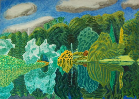
A few more green photo's  Remember it is not necessary to match exactly but to try and get a range of greens which work in a painting, and which you personally like. Also a painting by Adrian Berg, I like his style, playful, recognisable but not photographic, kind of jolly.


COLOUR: MIXING AND MODIFYING GREEN

Green seems to be a challenge to many, me inlcuded, maybe because it is such a natural colour and paint is by definition artificial, so it is easy to try and paint a landscape and get an artificial looking result.

Of course there is no such thing as a wrong colour but for the kind of painting you are trying to achieve you need to get the colour to fit. Like in music there are no wrong notes on an instrument but you proabably want to play in key and in tune.
Some artists like very bright vivid colours, David Hockney some of Van Gogh, and many others.


If you compare these with older art you can see a big  difference, in the older art the grees is much less green, more subdued.
 Willelm Roleof
Even the Impressionists were fairly gentle in their use of green, here's Monet's famous poppy field. 

You will find a lot of contemporary artists like to keep their greens under control but it is ok to go a bit wild and think 'I want my greens to be vibrant'. It is good to get to know the kind of colours you like, you don't have to paint like everyone else.

Anyway it is good to know what greens you have, what they look like and what range of greens they mix.
While I like to think we can use all our colours it is ok to  find what you like and stick to it, there are lots of artists who never touch viridian or emerald finding them far too vivid. And for some artsits a noaaow range of light dark and middle green is sufficient.
Some never use ready made greens at all prefering to mix them from blues and yellows.

Essentially you need a starting green, a light and pale green,then a light and bright, deeper greens, warm green, autumnal greens, cool green, dark greens, and grey-greens.
I've started with Sap green and put out what I want to modify it with: lighter side: Lemon yellow, Cadmium Yellow, Raw Sienna (yellow ochre will do a similar job) Cadmium Orange, Alizarin Crimson, on the other side, Ultramarine, Burnt Umber, Black (Payne's grey will give an even stronger dark green)

DO MAKE NOTES AS YOU MIX, I HAVE ALSO PUT THE COLOURS on neat WHICH  I AM MIXING WITH

You will see I haven't attempted to match the colours but to get the kind of colours I see, lighter and paler in the background, lighter and brighter in the foreground, pale blue-greens for horizon trees. Very dark greens for big trees, browner greens for row of trees and shrubs.

Don't worry about matching my colours (I think I could do better!) but try and see from what you can mix, what suits the different areas.


Saturday, 4 April 2020

more colour


A few small studies in colour first making a range of yellows mixing lemon yellow with very small amounts of crimson and blue and white, (this is acrylic), but trying to keep it within the range of recognisable yellow. then the same with red, modifying but trying to keep it looking red. Yellow has a narrow range add just a tiny bit much blue and it no longer looks yellow, same with adding too much red so it is an exercise in subtle thoughtful mixing. 


Wednesday, 1 April 2020

colour modifying.

This post is about modifying colour, it is colour mixing, but carefully, so that you keep the colour still looking blue, using blue, I was using acrylic, and used cyan crimson and lemon yellow, and white. The idea is to modify the blue with small amounts of the other colours but keeping within the range of blue. so a little bit of red, , then same with some white, then a little bit of lemon, then same with white, then a little bit of red and lemon, and again same with a white. 

Finally I tried to mix as dark as I could, obviously no white this time mostly blue and red with a little lemon, too much of the latter would lighten it, you ought to be able to get something quite dark. Then add white to see if you have got a grey.

The point of this is to mix colours in a controlled manner making small but visible modifications. Colour mixing step by step.


Monday, 30 March 2020

30 03 2020 colour 1

trying this to see if it works as an alternative to facebook

looking at Colour this coming month.
This is fairly basic, getting to know 2 colours at  time rather than all of them! red and blue, but using two reds and two blues to compare. Cadmium red and Phthalo blue, (also known as Intense Blue or Winsor Blue; the blue with three names! if you don't have phthalo blue you may have Prussian blue whihc is similar if a bit darker, but will do) will give quite a different purple to Ultramarine and Alizarin Crimson (any crimson will do) Similarly cadmium red and cadmium yellow will give a different orange to crimson and lemon, again phthalo blue and lemon will give a very bright green whereas ultramarine and cadmium yellow will give a much more subdued green. try it, make notes and make a little painting using some of the mixes.


 A basic colour mixing process, take two colours and mix in 3 stages, blue with a little yellow, blue and yellow equally mixed- this may not mean equal quantities as colours are not equally strong you will find a little phthalo blue is very strong whereas lemon yellow is quite weak.then yellow with just a little blue. This model of colour mixing is meant to help you mix carefully and in stages.  The 5 colours you get from 2 colours can be stretched to 10 if you have strong and dilute versions of each, adding more water for watercolour, white for acrylic or gouache.