Friday, 17 April 2020

DRAW A TREE
A single tree will have many hundreds of leaves, in a glance you see them all, well all that are facing you. It can be confusing: how do I draw that thing which is one and many at the same time?

As well as looking, you need some kind of pattern to help you. I often think to draw you need to organise what you see in your head, sort of take it apart and re-assemble it.
You see detail, it is what our eyes are good at, but to draw something complex or manifold, if that's the word, you need to simplify it into stages.
1. Start with the idea of a tree, a bit like a lollipop. The direction of the light usually coming from above, will determine the shadow/shading.


2. A real tree will of course have more shape, a leafy shape.
It is worth getting familiar with a sort of made up template for a tree. then applying what you understand to a real tree.

3. When looking at a real tree it may be helpful to imagine it wrapped in cellophane see the simplified overall shape.

4. Then note that it is divided into a number of smaller shapes, a bit like a man carrying lots of  cloud shaped balloons. Each shape is a bunch of leaves on the network of twigs on a single branch, but these smaller shapes add up to a single tree shape. 

5. These shapes have a light side, usually the top and a shady underside, and they will often overlap, the light top of one bit meeting the shade of the bit behind and above. 
6. You may want to add a suggestion of leafy-ness to your marks.


 Now some artists like leafy looking trees,others like to simplify  into blocks of light and shade, do look at different artists, this helps you see that there is a style for you, remember you don't have to draw every leaf- you are not a human photocopier or camera; we have machines for that, you can work in a way that suits your skill level and artistic preferences.  Or if you are like me, sometimes you are a bit lazy and want to do things simply other times you want the challenge of looking harder and focusing with all your powers.

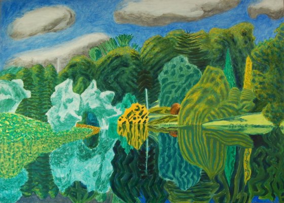
 Here are two  efforts of mine the first is more textured with a suggestion of leaves, but not losing the structure, the second I have  focused on the structure described in shape, light and shade.


Tuesday, 14 April 2020

we have used this photo for years as a drawing exercise , yes it is meant to be upside down if you do print it off keep it upside down, the point is to hinder you thinking about what it is and focusing on what the shapes and proportions are. The theory being that when you think, it is several ladies you stop looking at the shapes lines proportions and think of the subject. Do it same size start at one corner one shape at a time assessing the line and shape, its size angle etc. then the next shape then the next. It can be done with varying degrees of accuracy and concentration so if you want to be very strict, then go for it concentrate as fully as you can, but you will find you can be a little less rigid and still get good results, enjoy each shape see it as a full and goodly shape and give each shape it's due. You can turn it round at the end. And as with all exercise repetition is good, you can use a different picture of course one with good strong shapes

Monday, 13 April 2020

Gave it a go, Using acrylics means blending has to be done fairly quickly. I did find the video helpful starting with the highlight and blending around with darker colour.


Still thinking about colour, I did think for those who have done a lot of colour mixing and who may want more of a challenge looking at how to paint metallic objects may be interesting, I gave it a go this morning, trying to paint a gold ring and it was a disaster! so back to the drawing (painting ) board for me! meanwhile found this, there are lots of very generous people online sharing how to draw and paint do use them for when your teacher fails. This is oil paint which gives us a lot of time to blend whereas if you use acrylic of course it dries quickly so the same blending isn't possible unless you work quickly, it would work well I think in pastel.
Two things to note:1. you don't need metallic paint! it is just colours and tones. 2. note how much darkness there is, when he first puts the dark colour I thought that doesn't look like gold/brass, but be patient, in fact in shiny metal only a small area is light and your brain think s it is seeing lots of light shiny stuff.
of course this bloke is good, and makes it look easy, don't be hard on yourself if it doesn't look brilliant first time. but give it a go.

Friday, 10 April 2020


Gable ends can be a challenge, there are angles the eye doesn't pick up, you have to know they are there. If this isn't clear do let me know, there will be more!

DRAW ANYTHING JUST DRAW. 


Tuesday, 7 April 2020

One of 
the 
best 
ways to improve is repetition, you don't get fit by doing an exercise once. But thoughtful repetition i.e. can I improve, so here is version one and version two, I think version two is a slight improvement. 


Monday, 6 April 2020

A few more green photo's  Remember it is not necessary to match exactly but to try and get a range of greens which work in a painting, and which you personally like. Also a painting by Adrian Berg, I like his style, playful, recognisable but not photographic, kind of jolly.